A brand identity built around a name that already knew where it was going.

THE STARTING POINT
Avantro came to us before its first product had shipped. They were building technology around fitness, wellbeing and everyday life, with ambitions beyond India.
The challenge was to create a brand that could feel credible from day one.
THE PROBLEM
The category was already crowded with symbols, shapes and visual noise. Avantro needed to feel premium without becoming distant, and accessible without blending in.
The name already had something strong in it. We decided to build around that.
THE IDENTITY
We built the identity around the Avantro name, with a precise wordmark and a visual system that balances technology with a more human feel.
Project
Avantro Labs
Year
2026
Client
avantro-labs
Category
Brand Identity




About
The starting point
Avantro Labs came to us before a single product had shipped. No market presence. No recognition. Just a founder with experience building IoT products and a clear idea of where he wanted to go.
The ambition was bigger than another smartwatch. Avantro was building around problems in fitness, wellbeing, and everyday life that hadn’t been properly solved yet using AI and IoT to get there.
The problem
The challenge was finding the space between premium and accessible.
The brand needed to feel credible enough to sit beside names like Dyson and Garmin, but still feel relevant to someone buying their first piece of fitness technology. Go too premium and the brand becomes distant. Go too accessible and it disappears into an already crowded category.
The identity
The wordmark was designed to sit in the middle not the cold geometry of enterprise technology, and not the soft visual language of wellness brands. Precise, but with enough warmth to feel human.
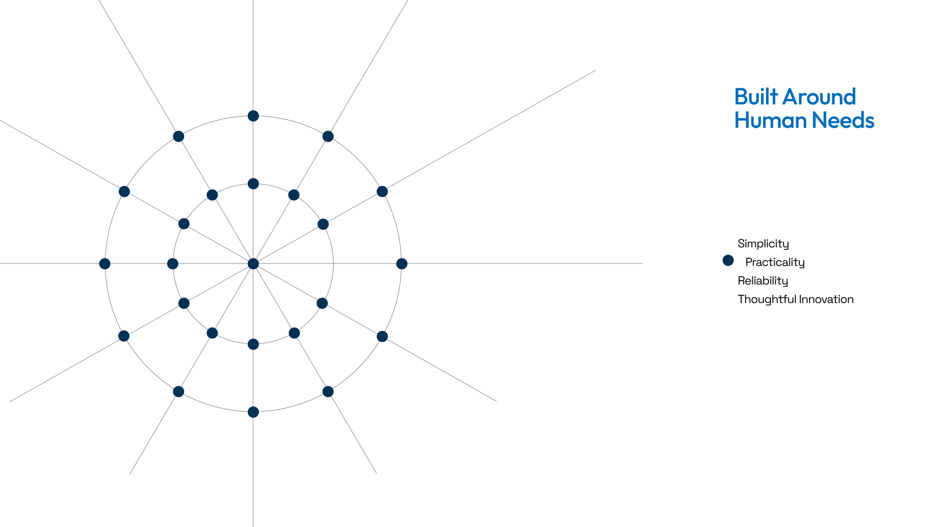
The secondary mark came later: a circular system derived from a triangular human element and expanded radially. Rather than replacing the wordmark, it became the brand’s depth layer appearing across patterns, textures, packaging, and supporting applications.
We built the rest of the system around the same thinking: a trust-first colour palette, clean typography, and a visual language designed to work across products, packaging, digital interfaces, and future collaborations.


